Wednesday, February 24, 2010

IValueConverter Interface

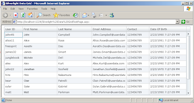
In my first post on silverlight I have display the column date of birth in the datagrid of the silverlight 3.0 controls. As you can see in that post and for your I have used that image over here. You can see in the image below that in the date of birth column time is also displayed, which is not good, as the name of column suggest the date not the time. So in order to display only date for the date of birth column I have used the IValueConverter interface with is used to display only the date part of the date of birth.


IValueConverter:
If you want to associate a value converter with a binding, create a class that implements the IValueConverter interface and then implement the Convert and ConvertBack methods. Converters can change data from one type to another, translate data based on cultural information, or modify other aspects of the presentation. For examples of some typical converter scenarios, see "Data Conversion" in Data Binding Overview.
Value converters are culture-aware. Both the Convert and ConvertBack methods have a culture parameter that indicates the cultural information. If cultural information is irrelevant to the conversion, then you can ignore that parameter in your custom converter.
The Convert and ConvertBack methods also have a parameter called parameter so that you can use the same instance of the converter with different parameters. For example, you can write a formatting converter that produces different formats of data based on the input parameter that you use. You can use the ConverterParameter of the Binding class to pass a parameter as an argument into the Convert and ConvertBack methods.(Source)
In order to achieve above goal of only displaying the date part in the date of birth column, during binding of the date of birth column I have create a class which is used to return only the date part. Below is the code for my date conversion class, here I have implemented the convert function but not the ConvertBack function.

public class ShowDatePart : IValueConverter
{
public object Convert(object value, Type targetType, object parameter, CultureInfo culture)
{
DateTime dtpDate = DateTime.Now;
dtpDate = (DateTime)value;
return dtpDate.ToString("dd/MM/yyyy");
}

public object ConvertBack(object value, Type targetType, object parameter, CultureInfo culture)
{
return value;
}
}
Here is the xaml code to include the namespace in which my date converter is placed.

xmlns:local="clr-namespace:SilverLight_Converter"
In the following example, local maps to the namespace in which DateConverter is defined, and I have set the name of the converter here which is DisplayDate. So anywhere in the xaml code if I need to used it then I can used name of the static resouce there.
< UserControl.Resources >
< local:ShowDatePart x:Key="DisplayDate"/ >
</UserControl.Resources>
Here is the date column xaml which is used to show date only, and you can see the syntax of binding part. In the below example external data source property DateOfBirth is bound which also contain the date part, but as I have placed the Converter , only the date part is displayed in the below case.
< data:DataGridTextColumn Header="Date Of Birth" Width="160" MinWidth="120" Binding="{Binding DateOfBirth, Converter={StaticResource DisplayDate}}" CanUserSort="True" IsReadOnly="True" CanUserReorder="False"/>
Here is the output after using the Date converter in the xaml file. You can see now the date of birth column only show the date part and the time part is not shown.
You can download the source code from here
All and any comments / bugs / suggestions are welcomed!
Tuesday, February 23, 2010

SilverLight 3.0 DataGrid Control For Beginners

I have just start learning silverlight and I will now share my knowledge of my silverlight with you peoples. For my first post regarding silverlight I have choose datagrid control which is one of my favorite control if I look back to the asp.net. In this post I will show you how you can bind datagrid control with the data source and also about the formatting of the datagrid control. Below is the output of the example code, here you can see a datagrid which is used to display information about the Person. Like User id, First Name, Last Name, Email address, Contact number and date of birth.

Let us start our example, Below is the namespace which you need to add in yours xaml file , if you want to add the datagrid manual , if you drag and drop the data grid control from the tool bar then this namespace will be added automatically.

< UserControl xmlns:data=
"clr-namespace:System.Windows.Controls;assembly=System.Windows.Controls.Data" ... >
And blow is the xaml of the adding the datagrid and setting some of the properties of the datagrid control. Here you see that I have set the name of the datagrid and GridLineVisibility and AutoGenerateColumns properties of the datagrid. As I don't want datagrid to generate columns so I set this property to false, as I will add my columns in the datagrid column collections.

< data:DataGrid Margin="5" x:Name="dgrDataGrid" Height="300" VerticalAlignment="Top" HorizontalAlignment="Center" GridLinesVisibility="All" AutoGenerateColumns="False" >
Below table list some of the basing properties of the data grid control. I have list down the properties with there description.
Property
Description
RowBackgroundRowBackground sets the brush that’s used to paint the background behind every row.
AlternatingRowBackgroundIf you set AlternatingRowBackground, alternate rows are painted with a different background color, making it easier to distinguish rows at a glance. By default, the DataGrid gives odd-number rows a white background and gives the alternating, even-numbered rows a light gray background.
ColumnHeaderHeightThe height (in pixels) of the row that has the column headers at the top of the DataGrid.
RowHeaderWidthThe width (in pixels) of the column that has the row headers.This is the column at the far left of the grid, which shows no data but indicates the currently selected row (with an arrow) and indicates when the row is being edited (with an arrow in a circle).
ColumnWidthThe default width of every column. If you define columns explicitly, you can override this width to size individual columns. By default, columns are 100 pixels wide.
RowHeightThe height of every row. This setting is useful if you plan to display multiple lines of text or different content (like images) in the DataGrid. Unlike columns, the user can’t resize rows.
GridlinesVisibilityA value from the DataGridGridlines enumeration that determines which gridlines are shown (Horizontal, Vertical, None, or All).
VerticalGridlinesBrushThe brush that’s used to paint the grid lines in between columns.
HorizontalGridlinesBrushThe brush that’s used to paint the grid lines in between rows.
HeadersVisibilityA value from the DataGridHeaders enumeration that determines which headers are shown (Column, Row, All, None).

Defining Columns :
If you set autogeneratColumn property to true the column are generated automatically you can’t control how columns are ordered, how wide they are, how the values inside are formatted, and what header text is placed at the top. A far more powerful approach is to turn off automatic column generation by setting AutoGenerateColumns to false. You can then explicitly define the columns you want, with the settings you want, and in the order you want. To do this, you need to fill the DataGrid.Columns collection with the right column objects. Below table show the three columns supported by datagrid control.

Column Type
Description
DataGridTextColumnThis column is the standard choice for most data types. The value is converted to text and displayed in a TextBlock. When you edit the row, the TextBlock is replaced with a standard text box.
DataGridCheckBoxColumnThis column shows a check box. This column type is used automatically for Boolean (or nullable Boolean) values. Ordinarily, the check box is readonly; but when you edit the row, it becomes a normal check box.
DataGridTemplateColumnThis column is by far the most powerful option. It allows you to define a data template for displaying column values, with all the flexibility and power you have when using templates in a list control. For example, you can use a DataGridTemplateColumn to display image data, or use a specialized Silverlight control (like a drop-down list with valid values or a DatePicker for date values).
In my example code I have used the DataGridTextColumn and DataGridTemplateColumn but not the DataGridCheckBoxColumn. In below table I have mention some of the properties of the columns of the datagrid control (Source).
Property
Description
BindingGets or sets the binding that associates the column with a property in the data source.
CanUserReorderGets or sets a value that indicates whether the user can change the column display position by dragging the column header.
CanUserResizeGets or sets a value that indicates whether the user can adjust the column width using the mouse.
CanUserSortGets or sets a value that indicates whether the user can sort the column by clicking the column header
ForegroundGets or sets the brush that is used to paint the text contents of cells in the column.
HeaderGets or sets the content of the column header.
IsReadOnlyGets or sets a value that indicates whether cells in the column can be edited
SortMemberPathGets or sets a property name, or a period-delimited hierarchy of property names, that indicates the member to sort by.
In above table I have not mention all the properties , but some of them which I think are most commonly used. I have used SortMemberPath in the DataGridTemplateColulmn, so that user can sort the DataGridTemplateColumn as well, if you don't give the SortMemberPath then the DataGridTemplateColumn will not be sorted if you click on that column for sorting. And here is the code behind code which is used to bind the datagrid to the datasource.
dgrDataGrid.ItemsSource = Persons.GetDataItems();
Hope you have some idea about the datagrid control. In future post I will discover more about the datagrid control and share with you peoples.You can download the source code from here
All and any comments / bugs / suggestions are welcomed!